[FIX] Scaling Smart Objects With Nearest Neighbor in Photoshop
I've been creating a lot of pixel art lately and started to use Smart Objects in Photoshop to increase my productivity and layer organization. Scaling pixel art in regular layers is pretty straightforward with the "Free Transform" (Ctrl+T / Command+T) by setting the Interpolation to "Nearest Neighbor". When using Smart Objects, the Free Transform doesn't show the Interpolation setting for some reason. If you try to scale your pixel art Smart Object, it will use a Bilinear interpolation making your art all blurry and fuzzy.
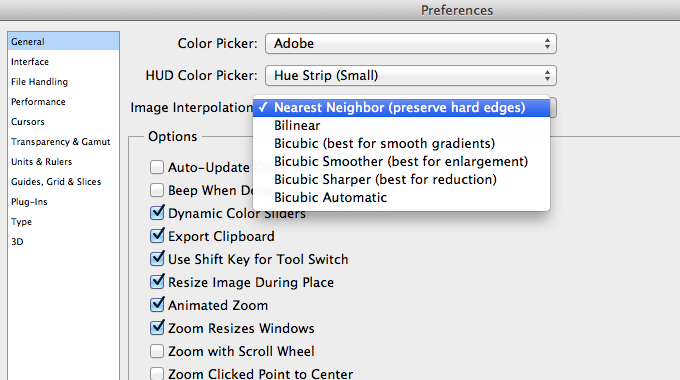
Apparently, Photoshop has a single setting to determine the scaling interpolation globally across the application. You can change this setting by going to Preferences > General > Image Interpolation. Changing this from "Bilinear" (default) to "Nearest Neighbor" will allow you to scale Smart Objects without it become blurry.

Must Read UI / UX Related News 2014
Last update: January 28, 2014
In this post, I will put a collection of interesting UI and UX design news, updates, trends, whatever I've found on the internet. I will include the link to the actual article and also a short overview of what's in there. Some stuff might be overlapping, which is actually good showing that multiple sources agree on the same things. The list below will show the most recent article at the top and has no particular order in terms of relevance or ranking. I will keep bumping this post whenever I update it. If you come across any interesting articles feel free to send me a message at [email protected].
7 unbreakable laws of user interface design
- Law of clarity
- Law of preferred action
- Law of context
- Law of defaults
- Law of guided action
- Law of feedback
- Law of easing
Should I Use A Carousel?
So...Should I...? Funny little website explaining why you shouldn't use one for your website. Here's an article on CreativeBlog with an in-depth interview with the creator Jared Smith.
12 Outdated Web Features That Need to Disappear in 2014
- Irrelevant Elements
- Flash Intros
- Photo Carousel
- Large Hero Images
- Stock Photos
- Animated GIF Flags
- Autoplay Videos
- Automated Popups
- 'Hello World' Blog Post
- Sidebars
- Reloading Pages
- M.dot Sites
14 Design Trends for 2014
- Theming Apps
- Color as Affordance
- Layers and Depth Within Apps
- Parallax
- Blur. Lots of Blur.
- Experimenting with Transitions
- Importance in the Details
- Content Impermanence
- Single-Use Pages
- Browser's Integration with OSes
- Physical Products Coinciding With Apps
- The Full Experience
Goodbye to 8 Design Elements Whose Time has Come
- The Drop-Down Menu
- Carousel
- Internet Explorer 9
- Skeuomorphism
- Flash
- Web Pages
- Shared Hosting
- “m.” Sites

Annoying Razer Synapse Updates
Ever since I installed Razer Synapse (Cloud-Based Mouse Driver) for my DeathAdder mouse I get very annoyed by the software updates. First of all, 99% of the time the update will require you to reboot your system which no ones likes. Especially when you just booted up your computer. Second, the windows where you confirm the update installation is pretty stupid as well.
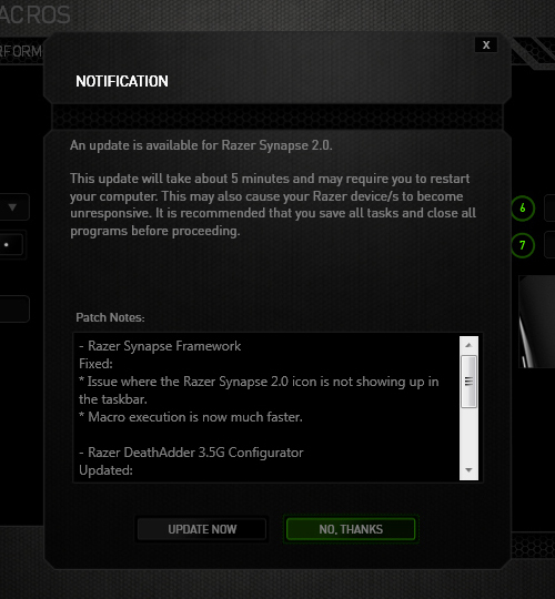
The image below is the default state in which the notification was presented. The "Update Now"(OK) option comes before the "No Thanks"(Cancel) option. Now there's always the debate whether the button arrangement should be "OK-Cancel" or "Cancel-OK". Both button orders are legitimate as the Nielsen Norman Group article points out, but what confused me was the button highlight. While updating the driver would be considered a "dangerous" action. I was immediately drawn to pressing the highlighted button, because in most UI cases they will highlight the option that they want you to press. So combined with the "I-just-want-to-get-this-over-with" mentality, I pressed the highlighted "No Thanks" option thinking it was updating when the window minimized to the system tray. Little did I know the update notification popped up again the next day when I turned on the computer... confused and enraged why Razer Synapse asked me to update again, I then discovered I was pressing the wrong button when I saw the update window for the second time. Am I raging about nothing? Or maybe I should just learn to read next time :(
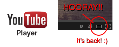
YouTube's Player Size Button is Back!

Hooray!! The YouTube player size button is back! A couple a days ago YouTube got a major update (Google+ comment integration) and it seems like they moved the player size button back to the video menu bar. In their previous update the player size button was moved and nested inside the cogwheel button. This was a huge pain in the ass since it required an extra step to perform an option that was very frequently used (you can read about the design and interaction analysis in my previous blog post).
Luckily, YouTube decided to put the player size button back on the video menu bar. Did they get too many complaints or did they just realize it was a horrible UI design choice? Anyway, hopefully they will put back the video quality button back is well haha.. To close this post, I would like to include the sound clip from Super Smash Bros below to celebrate the return of the video size button :)

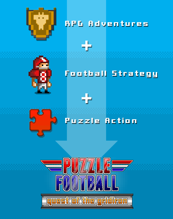
Puzzle Football Indiegogo Campaign!

Puzzle Football! The game that I've been working over the last couple of months as an interface designer and pixel artist just launched its Indiegogo funding campaign! If you love puzzle games (with RPG elements), football or just like mobile games in general you should definitely take a look :) http://www.indiegogo.com/projects/puzzle-football-quest-of-the-gridiron/x/5032688

YouTube's New Video Player UI
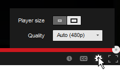
You've probably noticed the subtle change in the YouTube video player UI implemented a few days ago. They moved the "Player Size" and "Video Quality" buttons and incorporated them into the Cogwheel button. Their goal was to make the video player UI more compact and they've achieved that doing so.
Personally, I hate the new UI... not because I hate change, but because they moved the 2 of my most used buttons and nested them within another one. From an interaction standpoint the previous UI was simple:
- Set to Player Size: (1) Press Player Size button
- Change quality: (1) Press Video Quality button, (2) Set desired quality
Now with the new video player UI I have to perform an extra interaction in order to change the screen size and video quality:
- Set to Player Size: (1) Press Cogwheel button, (2) press Player Size button
- Change quality: (1) Press Cogwheel button, (2) Press Video Quality button, (2) Set desired quality
One extra interaction doesn't seem much, but for me and I think for a lot of other users it's an annoyance. Also, visually the new Player Size button is a bit weird. It looks like a toggle switch but it acts as a slider. I get confused sometimes thinking the "darker" side is the active one.. it's actually the other way around. To make it more intuitive and clear, there's a simple fix simply by adding a more distinctive rounded corner and by adding a drop shadow to the activated side.
3DS Max Adventures! Volkswagen Jetta WIP
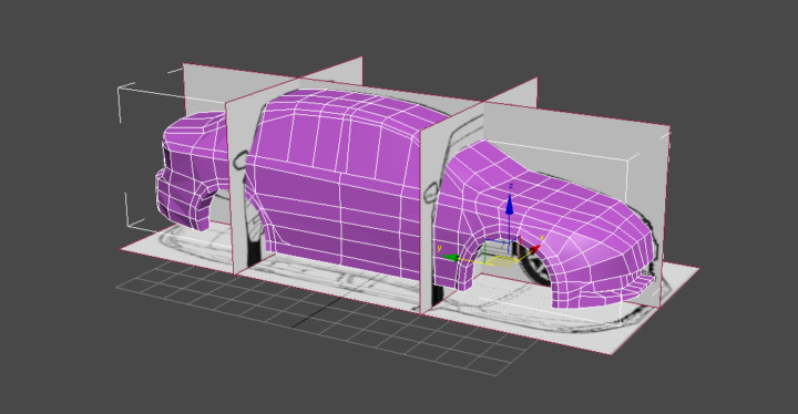
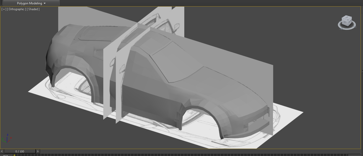
What have I been up to lately? Well busy applying for jobs, working on art for a NDA mobile game and some 3D modeling of course :) As I mentioned in an earlier post, the second car model would be the Volkswagen Jetta. I got the rough shapes finished and started adding the details. I would say the car model is about 80% done before I can edit the normals and unwrap the UVs. The model is about 4000 tris at the moment, so it should be no problem keeping it under 20.000 tris.
Volkswagen Jetta rough shape

Jetta detailing
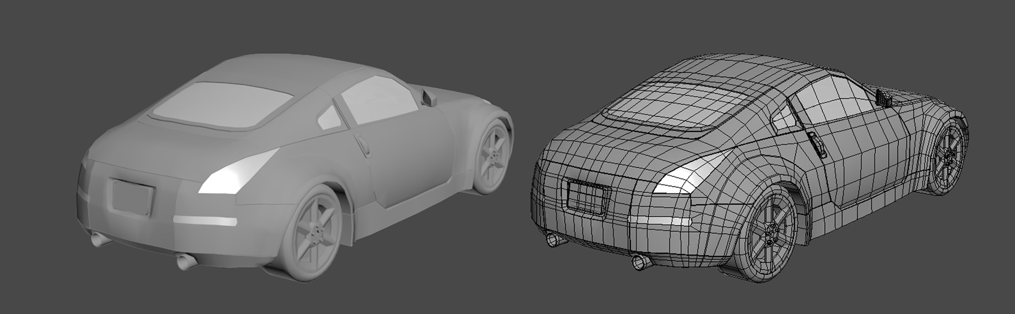
3ds Max Adventures! Nissan 350z
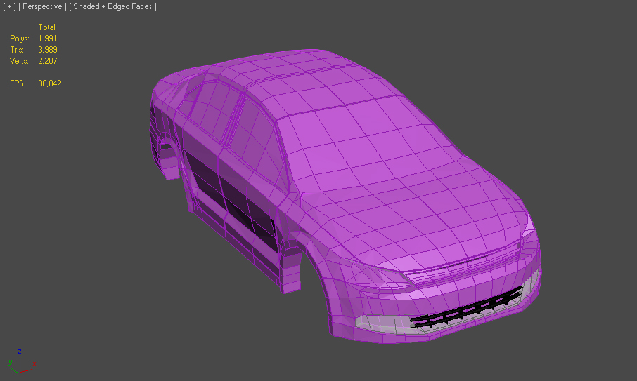
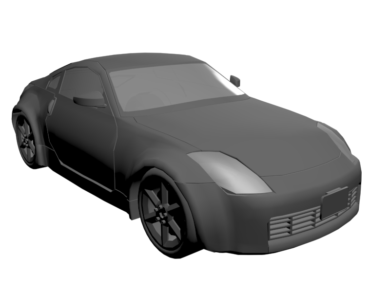
I finally finished modeling the Nissan 350z car model! I had a lot of trouble getting the topology right especially with the curved creases. I didn't want to add any unnecessary topology just for the creases, so I had to play around a bit until I was satisfied with the results. Overall I'm very satisfied with my very first modeled car and it's only about 11.000 tris in total without the wheels. The next car I'm going to model is a Volkswagen Jetta!

3ds Max Adventures! Character & Car
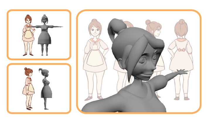
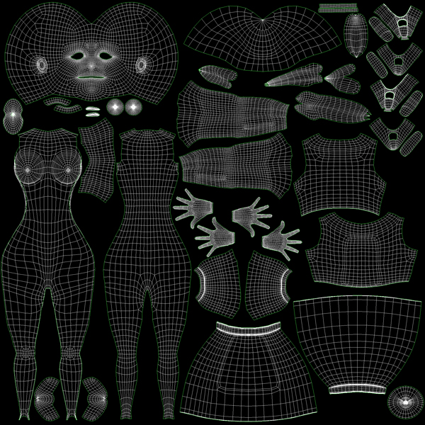
I started learning modeling with 3ds Max recently in order to make game assets in the future. I started off by modeling a character based on my friend Nicole's 2D drawing.
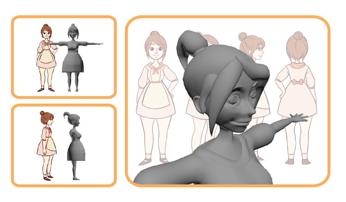
I got the UVs unwrapped and applied some basic colors to the model, but I'm too lazy to finish the texture for now.
 |
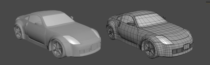
 |
At the moment, I'm working on a Nissan 350z car model. I have no knowledge of cars or whatsoever, so I just picked out a random one with blueprints that I could use. The goal of this model is to keep it under 20.000 tris.
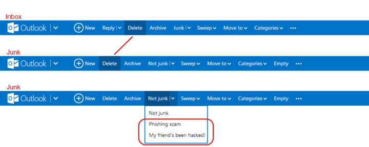
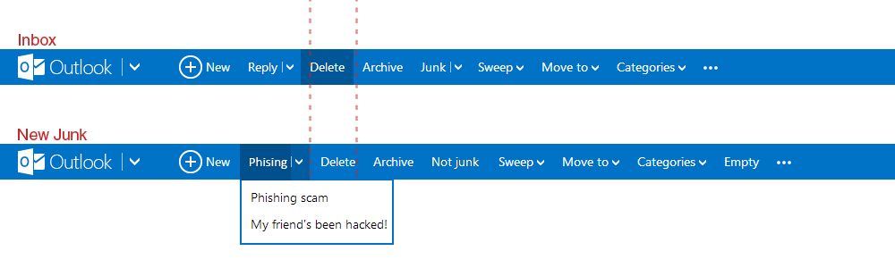
Outlook.com's UI Inconsistency
I like Outlook.com (revamped Hotmail), but there's an inconsistency in the Outlook.com's user interface which kind of bugs me. When switching from the inbox to the junk page, the "Delete"-button shifts to the left. If I'm in a hurry deleting emails from my inbox and junk, switching between the pages will cause me to accidentally pressing the "Archive"-button when I actually want to delete the email. Also, there's the weird categorization where they put the options to flag the junk mail message as "Phishing scam" and "My friend's been hack!" under the button "Not Junk"... Isn't that the opposite?
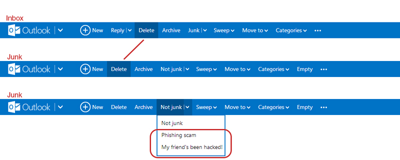
They could have move the phishing and hacked option under a new tag called "Phishing" for example, and place it left of where the "Delete"-button is. This way it shifts the delete to the right making everything more of less aligned and consistent with the Inbox UI.