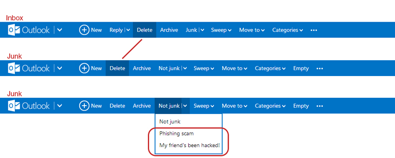
I like Outlook.com (revamped Hotmail), but there’s an inconsistency in the Outlook.com’s user interface which kind of bugs me. When switching from the inbox to the junk page, the “Delete”-button shifts to the left. If I’m in a hurry deleting emails from my inbox and junk, switching between the pages will cause me to accidentally pressing the “Archive”-button when I actually want to delete the email. Also, there’s the weird categorization where they put the options to flag the junk mail message as “Phishing scam” and “My friend’s been hack!” under the button “Not Junk”… Isn’t that the opposite?
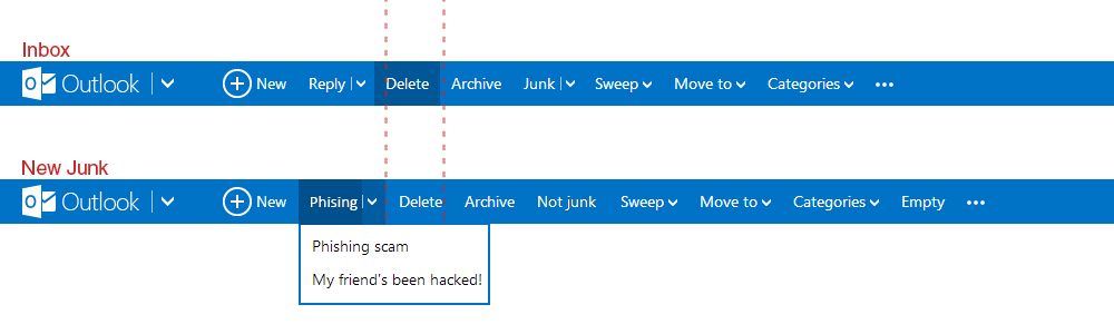
They could have move the phishing and hacked option under a new tag called “Phishing” for example, and place it left of where the “Delete”-button is. This way it shifts the delete to the right making everything more of less aligned and consistent with the Inbox UI.
Related Posts
[FIX] Unity3D – Animation Must be marked as Legacy Warning
How to fix animation warning "must be marked as legacy" in Unity3D

[Unity3D] Copy to Clipboard Script for iOS & Android
Handy Unity3D script to copy to clipboard for mobile devices